
A team section is one of those website components that looks simple until you need to make it reusable. Editors need to add people, upload photos, reorder team members, and update bios without asking a developer to edit markup every time.
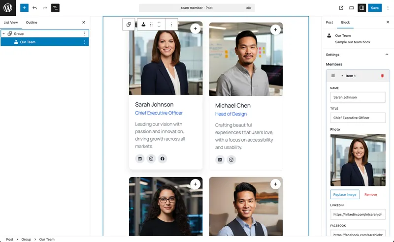
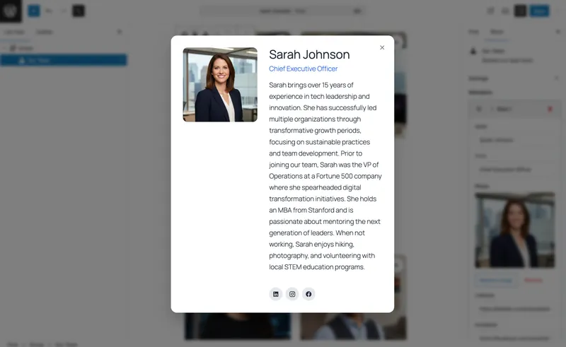
This tutorial shows how to build a Team Member Grid block in WPBits Block Studio. The block uses a repeater field for team members, renders a responsive grid on the frontend, and opens each member’s full profile in a modal.
The important part: you can build the block through the product workflow instead of setting up a full custom block development stack.
Why This Block Is Usually More Work Than It Looks
The conventional way to build this in WordPress often involves several moving parts: registering a custom block, creating editor controls, handling repeatable data, writing frontend markup, styling the grid, and adding JavaScript for the modal behavior.
For a large product feature, that level of setup can make sense. For a team section, it is usually too much overhead. You still want clean output and a good editor experience, but you do not want a simple content block to turn into a custom React and build-tool project.
WPBits Block Studio keeps the workflow focused. You define the block, add the controls, add the template, add the styles and script, then use the block in the WordPress editor.
In this tutorial, you will create:
- A reusable
Team Member GridGutenberg block - A repeater field for unlimited team members
- Fields for name, role, photo, and biography
- A responsive card grid
- Modal details for each team member
- An editor-friendly block that clients can update themselves
Requirements
Before you start, make sure you have:
- WordPress 6.0 or newer
- WPBits Block Studio installed and activated
- Access to the WordPress admin
No separate Node, webpack, or React setup is required for this tutorial workflow.
For broader product setup and feature references, see the WPBits Block Studio documentation.
Step 1: Create a New Block
Open the WordPress admin and go to Block Builder. Create a new block and enter the basic block details.
Use these settings:
| Setting | Value |
|---|---|
| Block Name | team-member-grid |
| Block Title | Team Member Grid |
| Description | Display team members in a responsive grid with modal details. |
| Category | widgets |
Keep the block name lowercase and descriptive. It becomes the technical identifier for the block, so team-member-grid is easier to recognize later than a generic name like custom-section.
Step 2: Add the Repeater Field
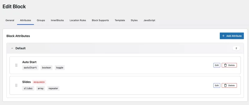
Open the Attributes section and add a new attribute for the team member list.
| Setting | Value |
|---|---|
| Attribute Name | team_members |
| Control Type | repeater |
| Label | Team Members |
A repeater is the right control for this block because every team member uses the same data structure. Editors can add more people without duplicating blocks, editing HTML, or managing separate custom post entries.
Step 3: Add Team Member Fields
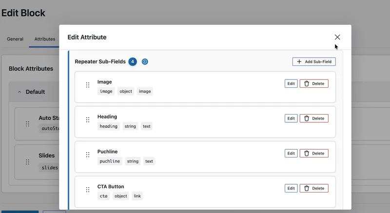
Inside the team_members repeater, add the fields below.
| Field | Attribute Name | Control Type | Label | Default Value |
|---|---|---|---|---|
| Name | name | text | Name | John Doe |
| Role | role | text | Role | Team Member |
| Photo | image | image | Photo | Empty |
| Biography | bio | textarea | Biography | Enter team member biography here... |
These fields give editors exactly what they need and nothing extra. The block stays easy to understand when someone opens it six months later to update the team page.
Step 4: Add the Template
Open the Template tab and add the template below.
<div class="team-member-grid"> {% for member in attributes.team_members %} <div class="team-member-card" data-member-id="{{ loop.index }}"> {% if member.image %} <img src="{{ member.image.url }}" alt="{{ member.name }}" class="team-member-photo" /> {% endif %} <h3 class="team-member-name">{{ member.name }}</h3> <p class="team-member-role">{{ member.role }}</p> <button class="team-member-more" data-modal-trigger="{{ loop.index }}">Learn More</button> </div>
<div class="team-member-modal" id="modal-{{ loop.index }}" style="display: none;"> <div class="modal-overlay" data-modal-close="{{ loop.index }}"></div> <div class="modal-content"> <button class="modal-close" data-modal-close="{{ loop.index }}">×</button> {% if member.image %} <img src="{{ member.image.url }}" alt="{{ member.name }}" class="modal-photo" /> {% endif %} <h2>{{ member.name }}</h2> <p class="modal-role">{{ member.role }}</p> <div class="modal-bio">{{ member.bio }}</div> </div> </div> {% endfor %}</div>The template has one job: turn the team_members repeater data into frontend HTML.
attributes.team_membersis the repeater value from the block attributes.- The loop renders one card and one modal for each team member.
member.name,member.role,member.image, andmember.biooutput the fields you added inside the repeater.loop.indexgives each card and modal a matching number, so the Learn More button can target the correct modal.
Step 5: Add the Modal JavaScript
Open the JavaScript tab and add the modal script.
document.addEventListener('DOMContentLoaded', function () {  // Open modal  document.querySelectorAll('[data-modal-trigger]').forEach(function (button) {    button.addEventListener('click', function () {      const modalId = this.getAttribute('data-modal-trigger');      const modal = document.getElementById('modal-' + modalId);      if (modal) {        modal.style.display = 'block';        document.body.style.overflow = 'hidden';      }    });  });
  // Close modal  document.querySelectorAll('[data-modal-close]').forEach(function (element) {    element.addEventListener('click', function () {      const modalId = this.getAttribute('data-modal-close');      const modal = document.getElementById('modal-' + modalId);      if (modal) {        modal.style.display = 'none';        document.body.style.overflow = '';      }    });  });});
The script exists only to connect the buttons to the modals.
- It waits until the page content is loaded.
- It finds every element with
data-modal-trigger. - When a visitor clicks Learn More, it reads the trigger value and opens the modal with the matching
modal-ID. - It finds every element with
data-modal-closeso the close button and overlay can hide the same modal. - It pauses page scrolling while a modal is open, then restores scrolling when the modal closes.
Step 6: Add the Frontend CSS
Open the CSS tab and add the grid and modal styles.
.team-member-grid {  display: grid;  grid-template-columns: repeat(auto-fill, minmax(250px, 1fr));  gap: 2rem;  padding: 2rem 0;}
.team-member-card {  background: #fff;  border-radius: 8px;  padding: 1.5rem;  text-align: center;  box-shadow: 0 2px 8px rgba(0, 0, 0, 0.1);  transition: transform 0.2s;}
.team-member-card:hover {  transform: translateY(-4px);  box-shadow: 0 4px 12px rgba(0, 0, 0, 0.15);}
.team-member-photo {  width: 150px;  height: 150px;  border-radius: 50%;  object-fit: cover;  margin-bottom: 1rem;}
.team-member-name {  font-size: 1.25rem;  margin: 0.5rem 0;  color: #333;}
.team-member-role {  color: #666;  font-size: 0.95rem;  margin-bottom: 1rem;}
.team-member-more {  background: #0073aa;  color: #fff;  border: none;  padding: 0.5rem 1.5rem;  border-radius: 4px;  cursor: pointer;  font-size: 0.95rem;}
.team-member-more:hover {  background: #005a87;}
.team-member-modal {  position: fixed;  top: 0;  left: 0;  width: 100%;  height: 100%;  z-index: 9999;}
.modal-overlay {  position: absolute;  top: 0;  left: 0;  width: 100%;  height: 100%;  background: rgba(0, 0, 0, 0.7);}
.modal-content {  position: relative;  background: #fff;  max-width: 600px;  margin: 5% auto;  padding: 2rem;  border-radius: 8px;  z-index: 10000;  max-height: 80vh;  overflow-y: auto;}
.modal-close {  position: absolute;  top: 1rem;  right: 1rem;  background: none;  border: none;  font-size: 2rem;  cursor: pointer;  color: #666;  line-height: 1;}
.modal-close:hover {  color: #333;}
.modal-photo {  width: 200px;  height: 200px;  border-radius: 50%;  object-fit: cover;  display: block;  margin: 0 auto 1.5rem;}
.modal-role {  color: #0073aa;  font-weight: 600;  text-align: center;  margin-bottom: 1.5rem;}
.modal-bio {  line-height: 1.6;  color: #333;}
The CSS handles presentation only.
.team-member-gridcreates the responsive grid..team-member-card,.team-member-photo,.team-member-name, and.team-member-rolestyle the visible team cards..team-member-morestyles the modal trigger button..team-member-modal,.modal-overlay, and.modal-contentcreate the full-screen modal layer.- The modal photo, role, and bio styles keep the detail view readable when the biography is longer.
Step 7: Save and Use the Block
Save the block, then open any page or post in the WordPress block editor.
Insert Team Member Grid and add a few team members. For each item, fill in the name, role, photo, and biography. Reorder the items to confirm the repeater works as expected.
On the frontend, test the block before handing it to a client or publishing it on a production page.
Check that:
- The grid responds cleanly on smaller screens
- Each Learn More button opens the correct modal
- The overlay and close button close the modal
- Long biography text stays readable inside the modal
- Photos are cropped consistently
- The block still looks correct when one team member has a shorter role or bio
Why This Workflow Is Easier to Maintain
The value of this approach is not just the first build. It is the maintenance story.
With a conventional hand-coded block, a small content change can lead to developer involvement if the editor experience was not built carefully. With this WPBits Block Studio setup, editors manage team members directly in the block editor through structured controls.
You still get a custom block, but the repetitive setup work is reduced:
- The repeater stores repeatable team member data
- The template controls the frontend structure
- The CSS controls the presentation
- The small script handles the modal interaction
- Editors manage the content without touching code
That is the right balance for a common website component: custom enough to fit the design, simple enough to maintain.
Practical Extensions
Once the base block is working, you can extend it without changing the core pattern.
Useful additions include:
- A department field for larger teams
- Social profile links
- A location field for distributed teams
- A featured toggle for leadership profiles
- A select control for grid column options
The repeater pattern also works well for testimonials, speakers, service cards, portfolio items, and any other section where editors manage repeated content.
Final Result
You now have a reusable WordPress team member block with a responsive grid, modal profile details, and a clean editor workflow.
Instead of building the entire block stack manually, WPBits Block Studio lets you focus on the product tutorial essentials: define the fields, add the template, apply the CSS and JavaScript, then publish a block that editors can actually use.